The Contemporary Furniture Fair really showed its colors
 |
| Jonathan Adler for Kohler |
Bright, saturated, bold color is transforming otherwise sterile spaces. The International Contemporary Furniture Fair or ICFF brought with it a lot of color on an otherwise dreary rainy day.
 |
| Ergoergo.com |
The pixelated wallpaper pattern by Flavor Paper is definitely not for the faint of heart. I would love this in a niche, in the back of a bookcase, or as an accent wall. Designed by Simon Page, Flavor Paper will scale it proportionately to your space. Their motto is, "Good design excites." I concur.
How cute are these cubbies by Kast van ten Huis? They actually resemble the little canal houses where they are made in the Netherlands.
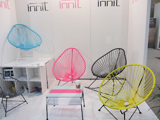
I can say from personal experience, these funky chairs from innit are really comfortable. They come in 11 colors from recycled material.
Koket features a highly edited, seductive collection influenced by fashion, fauna, design, and the decorative arts. Their pieces tend to stop you in your tracks.
Color reform rugs, rag rugs, silk and wool rugs, they are "color proud." I loved the original graphic rugs by Sonya; works of art in and of themselves. Sculpture for your floor.
Polart makes furniture for indoors or out. Team that with the illuminated accent pieces I've been seeing and you've got yourself a party.
It's a really exciting time in design. I am always amazed at the creativity around me. New materials and clever uses for the old. Upcycling and recycling, inventiveness and ingenuity all converge, and when it does ~ magic happens.
Hide and See
Some people prefer closets where everything is on display, maybe for better and faster access, where as others prefer to have their clothes neatly behind doors and drawers. I think I prefer a combination of both or maybe doors that can easily open up the space. I like to see everything I have because I always think I'm forgetting something. I love the top closet via Elle Decor, everything about it speaks to me but mostly the lighting. The three closets below are via Architectural Digest, first belongs to Alberto Pinto in his Brazilian home and third to Alfredo Paredes and Brad Goldfarb, are more masculine and austere, but both have great lighting as well. Lighting is an element we all want when getting dressed.
This closet, above, has a well lived feeling via Architectural Digest.
Tips I learned from this year's Kips Bay Decorator Show House
I was able to walk the Kips Bay Decorator Show house for a few hours and took a lot of it mentally and in photos. There is always something new to see for the first time and tones of inspiration to get from show houses. This year there was a lot of interesting details too good to not share them. When I looked at Thom Filicia's space the first thought I had was that he had set up his shop in the middle of Kips Bay Show house, although none the less beautiful. His space (above) called "The Gallery" was a walkway between the dining room, living room, entrance and hallway and every piece of furniture in it belongs to one of Thom's many furniture lines. The space had only two small walls of about 3 to 5 feet and two other even smaller ones. Magically Thom made it feel like a room. My conclusions of how he nailed it!
all images by Julie Yenicag for Belle Vivir
Painting the ceiling the same color as the walls not only make the space bigger by (blending the boundaries but at the same time it encloses it by making the space feel more like one whole space and giving the fifth wall (the ceiling) a more important roll. The high gloss walls bring movement.
A Light and airy chandelier instead of a closed one or a shaded one helps open up the space.
A black painting brings depth to a small space. The curtains help make the walls feel bigger.
Secure your runner in a stylish way. By Charlotte Moss.
Add a cool wallpaper to baseboard for a touch of whimsy. By Charlotte Moss.
Wrinkle-looking curtains for kids rooms is a brilliant idea. Very appropriate and fun. By Laura Bohn.
all images by Julie Yenicag for Belle Vivir
Kaydol:
Yorumlar (Atom)

.jpg)
.jpg)
.jpg)
.jpg)


_700x483.jpg)

.jpg)
.jpg)
.jpg)
.jpg)

.jpg)
.jpg)
.gif)
.jpg)


.jpg)
.jpg)
.jpg)
.jpg)


