Susan Zises Green had one of the largest spaces. It was beautifully layered with some of my favorite elements: leopard, jute, hand blocked textiles, old world charm, and a bar in a basket.
Alexa Hampton's bedroom was a knockout! For a traditionalist, she really balanced the contemporary space with aplomb. She hid a pole with a coromandel screen and swathed the room in fabric. The lacquered walls in Benjamin Moore's Dragon's Breath really set off the view. Stunning!
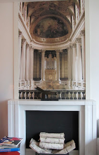
Raji Radhakrishnan imagined a room in the home of the curator of The Met. The well informed space, furnished with art deco and modernist pieces, a photo mural out of Versailles, and a mantle by Sir John Sloane, creates a melange of periods, just like The Met.
Charlotte Moss's room called, "Behind the Hedge" was a big hit. Wrapped in pistachio green (I told you there was a lot of green), boxwoods, and photo murals of a delightful garden, it was Alice in Wonderland like. Did I hear birds chirping? The baseboard molding was digitally designed on canvas to resemble delft tiles.
Thom Filicia's lacquered GREEN entry was the perfect portal to the rooms beyond. He also had a nod to Albert Hadley in the form of Mr. Hadley's famous sketches hung on the wall.
Jamie Drake, "Mr. Color" as I like to call him, continued the theme and added his own signature touch.
Robert Schwartz and Karen Williams for St Charles Kitchens designed the eat-in kitchen. These show house kitchens are always so knocked-out and somewhat unrealistic for most New Yorkers. Loved the built in planter!
ph: CLI, Trevor Tondo for NYT


0 yorum:
Yorum Gönder